The first generation Motorola Moto 360
Smart watches "Motorola" are a wonderful example of a skillful combination of modern technology and design in one compact and thoughtful gadget. This is evidenced by the second generation device. In our review we will discuss its first revision.
Content
Design
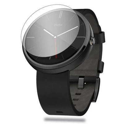
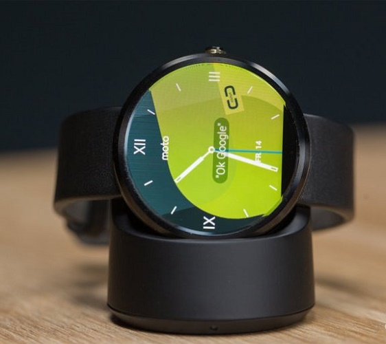
The appearance of the 1st generation smart watches from the "Motorola" turned out to be classic. It is a traditional round shape, something resembling ordinary "mechanics". However, perhaps it was precisely these analogies that the designers intended. The gadget comes in a proprietary box, which also has a rounded shape, which symbolizes the concept of the integrity of the device, when everything is expressed in one style.
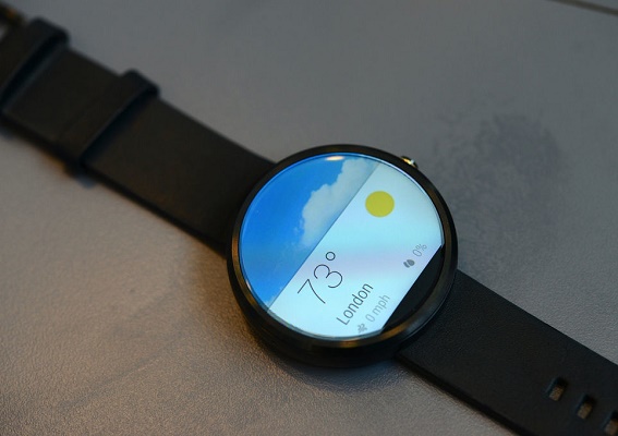
Of course, the appearance rather refers to the subject of discussion than to an objective assessment, but in the case of this model, we can safely say that the design is one of the strengths of the accessory.Perhaps, smart watches do not pretend to be unique or innovative, but elegance and compactness perfectly reflect the essence of their appearance. Laconic, not conspicuous strap completes the overall picture.
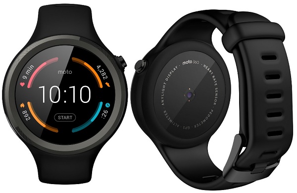
Separately, I want to praise different body color options. Most manufacturers are limited to one or two colors, but Motorola went further, offering a much wider range. To date, presented the black and metallic colors of the case, on the next metal bracelets and a golden case. It's nice to know that the possibility of choice and customization is present.
Important! The watch case is made of metal, the dial is protected by tempered glass that is resistant to small scratches. The protective glass has a slight bulge above the surface of the screen. This feature is not accidental: the bulge in relation to the screen creates the effect of increasing.
Screen
Watch Moto 360 though look at first glance completely round, in fact, are not so in full. Balancing between style and functionality, the developers decided on a bold move: the bottom of the dial is cut off by 30 pixels. It should be noted that this was a necessary measure, because the interface is placed in the lower part. The main control functions, such as the controller, screen brightness adjustment, etc., are located below. Of course, the decision is rather controversial, many users note some “clumsiness” in the visual aspect, which is rather difficult to get used to, because the lower part of the screen looks simply cut off.
The brightness of the screen and its layout issues do not cause, everything is pretty organic. The style of dials and the ability to quickly replace them are pretty good help for all those who like to experiment. The unique watch screen is made by the fact that this is the first gadget. with rounded TFT-IPS display. Because of the lower slice of the screen, its resolution is 320x290 pixels. Pretty good indicator for smart watches diameters 1.56 inches.
Important! The screen is perfectly readable from almost any angle and does not fade in the sun. The stock of brightness is also quite enough for comfortable work in all conditions of visibility.
Functional and Management
Smart watch Motorola Moto 360 function on the basis of "Android Viar", specially adapted OS for wearable electronics. Communication with the smartphone is carried out using a special application available in the Google Play store. The settings themselves are not so many, mainly they concern the enabling and disabling of prompts and notifications. All main options are rendered in Connect program. This is a special application designed for Smart watches from Motorola.
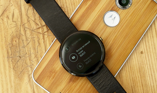
Important! In “Connect” you can easily change and set up the dials, manage the settings of time, personal profile, track recommendations. There are not so many settings for the gadget: adjusting the brightness, turning off the sleep mode, activating the “flight”, and turning off / rebooting the device.
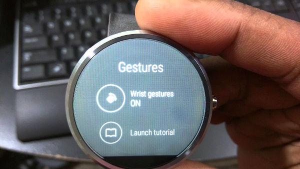
Most of the settings "Android viar" remained unchanged, but some of its individual elements are customized by the developer in order to bring something new to the interface design.
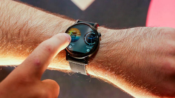
Smart watch is controlled using swipe up or down". Using simple gestures, you can view your activity, find out the time or switch the track. You can reject the notification or call by lightly pressing to the right of it.Swipe from top to bottom to the middle of the display includes an additional system window in which all the main parameters will be shown: time, date, charge level, etc. The virtual assistant is launched either with a single short tap on the screen, or with the phrase “OK, Google.”
Smart watch Motorola Moto 360 can lead pulse activity monitoring during the day. After measuring the indicators of the heart rate monitor, recommendations for activity are formed. However, the pulse measurement is possible and for a specified time, by manual command.
Of course, the Moto 360 watch equipped with a pedometer. The special Fit application has access to the user's step activity and on the basis of it builds up a recommendation system.
Additional features
Thanks to the integration of “Android Viar” with the Google Play store, the Motorola 360 Smartwatch can expand its basic functionality.. So far, the section for "Viar" is in the process of filling, and there are not so many useful programs in it. However, the smart watch is already possible download browser or applications to control your smartphone from the clock.
Special mention deserve the game, which can also be run on the clock.Porting from a mobile platform has undergone a classic, such as the game “Sea Battle”. However, in the "games" you can find more recent projects.
Important! None of the programs in the store will work as well as the pre-installed application. This is worth remembering before downloading anything from Google Play.
In general, the additional opportunities offered by the company store can be described as a positive trend. Constant content filling is rather a reason for optimism, another question is how long to wait for the software fully adapted for each model of smart watches.
Hardware specifications
Motorola Watch is built on a fairly functional hardware stuffing. Of course, it is difficult to name the available characteristics outstanding, but they are quite enough for comfortable work. The size of RAM is 512 megabytes. For smart watches this volume is enough for almost any task. Built-in 4 GB of permanent memory, but use it in your mind will not work. All of it, with rare exceptions, is allocated for the OS and applications.The gadget interface works smoothly, without failures and hangs, however, slowdowns sometimes occur.
Important! The device is equipped with a gyroscope. It is very convenient if the user is used to activate the wearable device without swipe or other auxiliary gestures. When the gyro mode is active, it is enough to simply change the position of the hand so that the screen goes out of sleep mode.
A significant disadvantage is the lack of a constantly active screen mode. This feature cannot be changed, since it is implemented at the hardware level. In this regard, well-functioning gyro looks like a significant advantage.
Working hours
Watch Moto 360 v1 can hardly be called a long-lived. If you use the gadget only periodically, looking at the time, with an active pedometer and heart rate monitor, the device has enough charge for one working day. Unfortunately, the device is unlikely to last a full day with all active modules. The indicator is very mediocre, especially considering the cost of the device. With an active watch load live up to 6-7 hours.
Knowing about the lack of work over time, the Motorola company released a fix update for the first revision hours.However, judging by the user reviews, this update did not significantly affect the autonomy.
Cost of
Watches from the company “Motorola” of the first revision can be bought in many large retail chains, or choose from the electronic catalog in the network. One way or another, the average price tag for a device will not vary greatly, basically it’s located at around 240-250 dollars. Given the indicators of autonomy and a rather specific form factor of the screen, such a price can be called quite bold. However, the watch will certainly find its buyer, and the point is not only in price.
Features and disadvantages
In the review I would like to note a few key features of the device.
- Product image. Certainly, the watches from “Motorola” were designed with an eye to some image. This is evidenced by their pointedly strict style without incorporating any sports or youth elements.
- Inductive charging option gadget. It is very convenient and does not cause any complaints, it is very convenient to use the charging for this watch, however, it has to be done quite often. Low autonomy immediately narrows the range of users of the device.For example, connoisseurs of high functionality, most likely, will bypass the gadget side. Connoisseurs of simplicity will be attracted by the forms, but a black slice at the bottom of the screen can scare them away.
- Software functions of pre-installed applications are implemented correctly.. All notifications are viewed and scrolled quickly. The watch responds correctly to gestures and functions perfectly under maximum load.
- The ability to dictate the answer to some types of incoming messages. This function is not fully implemented, but the concept itself is of genuine interest. Not every smart watch model supports such functions.
Most likely, the shortcomings written above will be corrected in the second revision of the device.
Conclusion
The gadget copes with its basic functions. Like a smart watch, this gadget is close to perfect. Of course, the model turned out with some flaws, but in general, the experiment with round shapes can be considered rather successful. And what really happened at the Motorola company is to attract the attention of users to the smart watch of a round shape.I want to believe that the first revision of the smart watch 360 is the beginning of a wave of interest in a new form factor.

/rating_off.png)


